3 Ways to Elevate Your Brand – Without Starting from Scratch
September 3, 2023
Not ready for a full rebrand just yet?
Here are 3 ways you can elevate your brand game without starting from scratch.
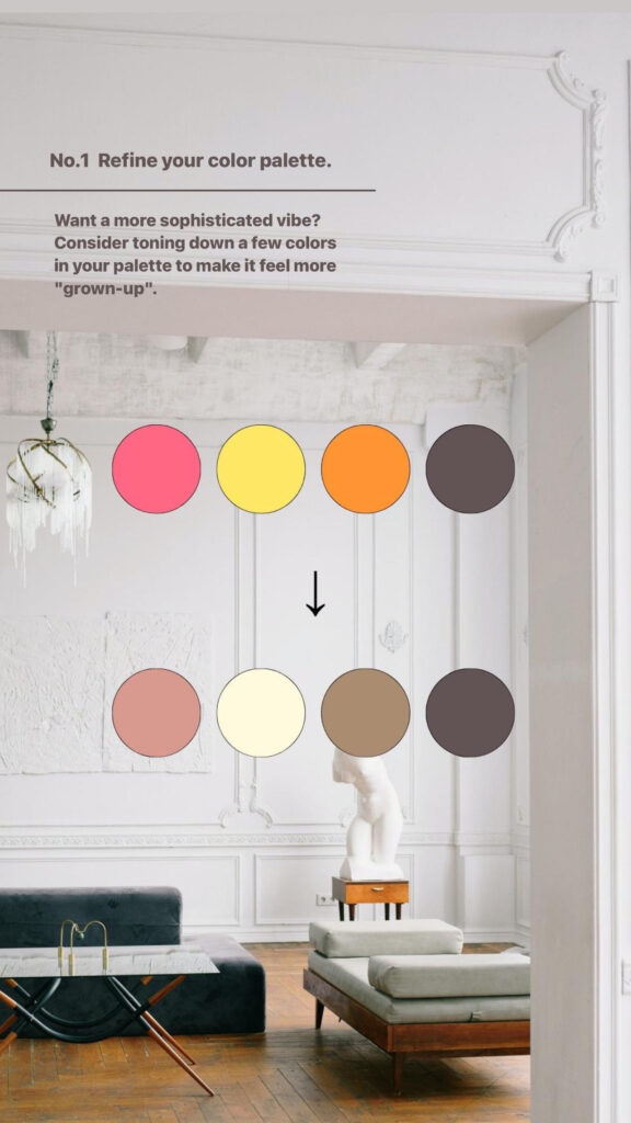
Refine your color palette.
Want a more sophisticated vibe? Consider toning down a few colors in your palette to make it feel more “grown-up”.
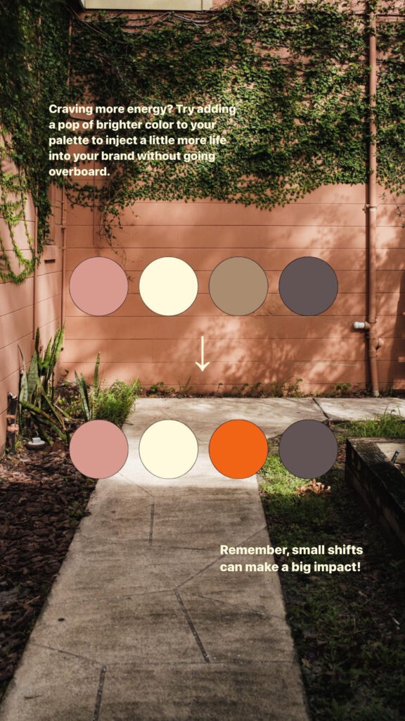
Craving more energy? Try adding a pop of brighter color to your palette to inject a little more life into your brand without going overboard. (Bonus points if it’s a color that’s out of the norm for your industry!)
Remember, small shifts can make a big impact!
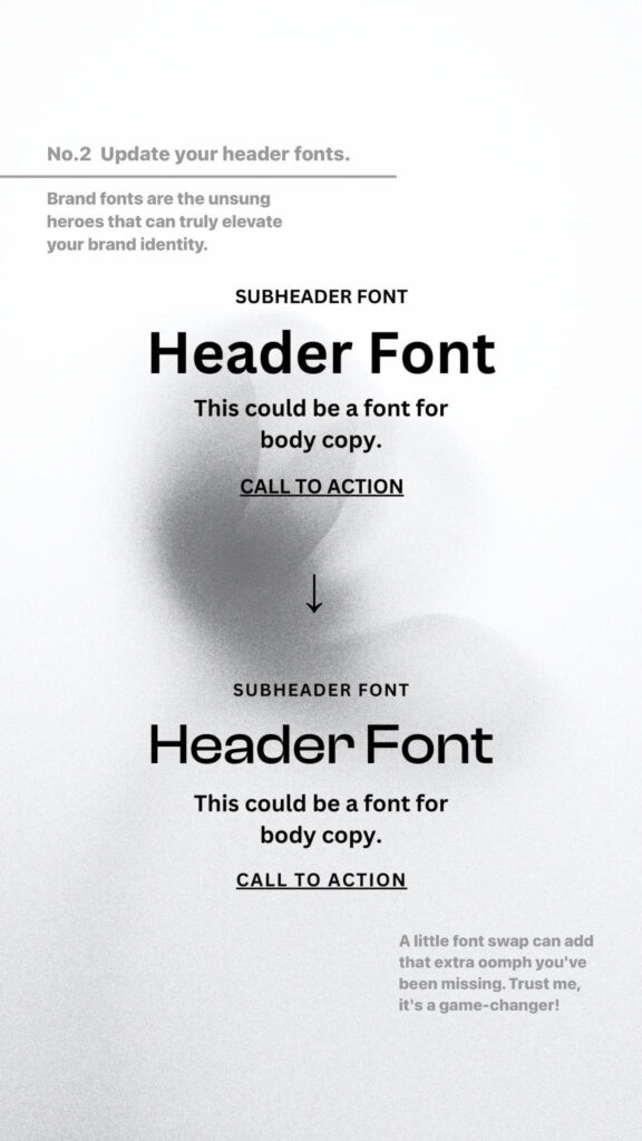
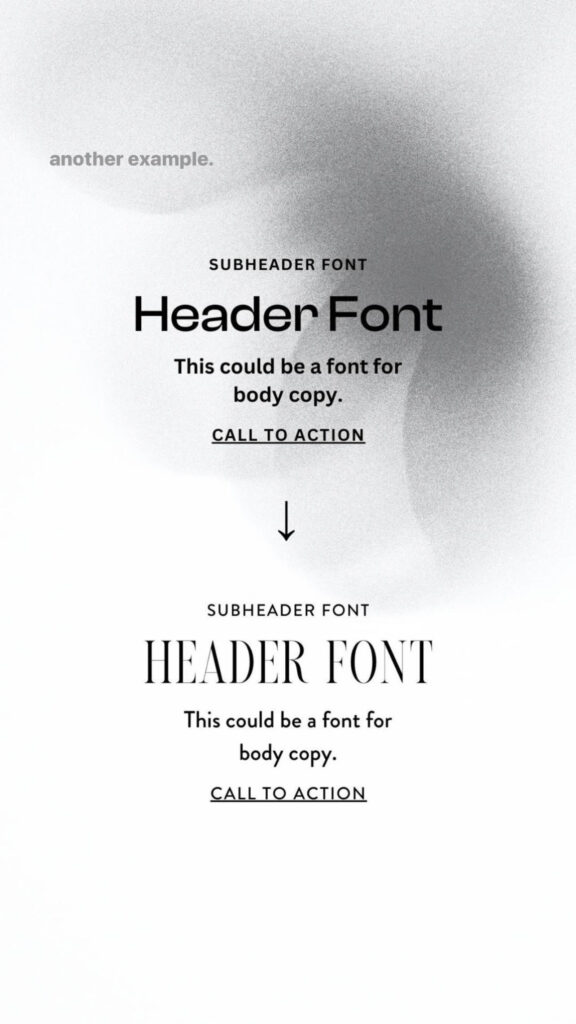
Update your header fonts.
Hot take: Your logo is not the star of your brand. (I mean, it still matters, but it’s not doing the heavy lifting.) Brand fonts are the unsung heroes that can truly elevate your brand identity. A little font swap can add that extra oomph you’ve been missing. Trust me, it’s a game-changer!

Revamp your marketing collateral.
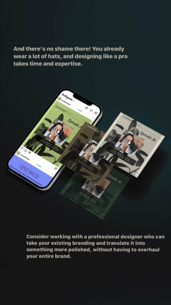
Guess what? Your branding might not be the issue—it could be how you’re using it. And there’s no shame there! You already wear a lot of hats, and designing like a pro takes time and expertise.
Consider working with a professional designer who can take your existing branding and translate it into something more polished, without having to overhaul your entire brand.
Need a diagnosis on what might not be working within your brand identity? Let’s talk! You may be just a few strategic tweaks away from showing up the way you want to.
Schematic Design Co is a brand + web design studio building plans for value-aligned businesses ready to take bigger swings and build something iconic.
Based in OBX, Creating from the Beach
home
about
services
portfolio
inquire
shop
blog
Download your free website report card!
Find us on the socials!
e: hello@schematicdesign.co
© 2025 Schematic Design Co. // Site Policies